
Did you have that moment when you finally nailed your design down to the last pixel? Then poof. You hit print and realized colors are too washed out. What went wrong? Well because you probably used RGB instead of CMYK. It’s not uncommon for many new designers including myself to make this mistake.
In this article, I will simply explain the crucial distinction between two of the most familiar acronyms in the field of graphic design: RGB and CMYK.
RGB
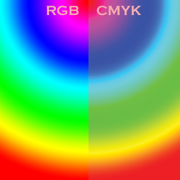
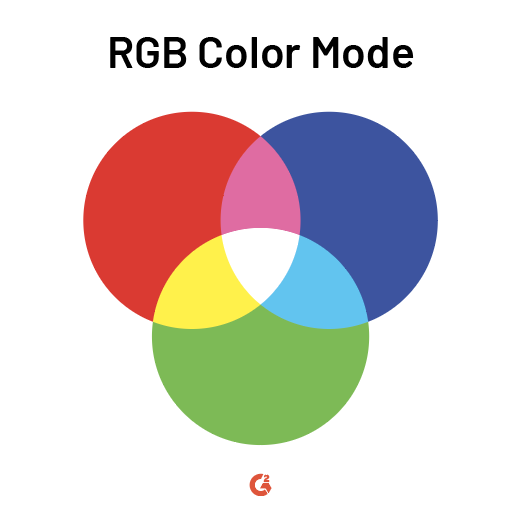
Electronic screens show color with different combinations of red, green and blue, hence the name RGB.
Screens display tens of hundreds of pixels. Each of these pixels are a mixture of red light, green light and blue lights. Each color has a value from 0 to 255.
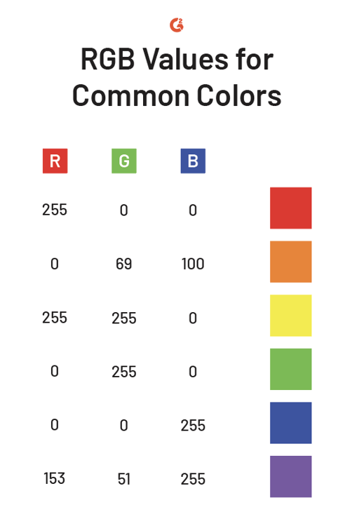
Take R:0, G:0, B:0 for example. The value combination produces black because there is 0% red light, 0% green light and 0% blue light.
Similarly R:255, G:255, B:255 produces white because of the maximum amount of light.
There are over 16 million possible colors in RGB mode. That’s a lot of options.
Here are some RGB values for common colors:
Remember RGB is additive. The more colors present, the lighter the result is.
CMYK
On the contrary, the combination of Cyan, Magenta, Yellow and Key (Black) is substractive. Adding colors to CMYK produces the opposite result of RGB, meaning darker results.
There is K because the other three colors cannot produce the purest black. (Interestingly enough, maximizing K and minimizing all other colors doesn’t create the darkest black. Instead the following scheme does: C: 75%, M: 68%, Y:67%, K: 90%). Just be careful this black can rip the low-quality paper.
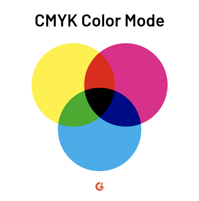
And yes, CMYKs are measured in percentages from 0% to 100%.
Take-Home Message
The rule of thumb is to use RGB for screen displays and CMYK for print media.
Many new designers make the mistake of accepting defaults, just to realize that their prints are too washed out or too vibrant. So don’t leave it to any chance. Choosing the right color mode upfront will save you a lot of time.

But don’t sweat too if you’re in the middle of the design. You can convert the color mode using resources like Photoshop and Illustrator.