
You can’t rely on highly subjective answers of people
People tend to answer with what makes them look good or with wat they wish they’d do. Not always they’ll answer instead with what they’ll actually do. Even if he wants to tell the truth, he will hardly remember what exactly you’re looking for? So, asking people will rarely give you the truth.
People like to please the interviewer
People have in-built bias in willing to please the interviewer. For example, few people will open and frank about the racism.
Most studies are flawed by design
Most studies are flawed by design (for e.g. sending a questionnaire out most people replying will be who have more time to reply). Same way if you knock on people’s doors those will be at home, unemployed… Even if you stop people in the street you’ll end up selecting friendlier or more agreeable personalities
Small samples are actually deceitfully misleading
For example, 1/3 of university faculty members end up marrying each other, when in reality the faculty has only 6 staff.
No two thing is comparable
Comparing statistics across countries or times present factors that are difficult to rely on. For example, one study links milk to cancer because countries that consumed more milk had higher incidence of cancer than countries with low consumption. High milk consumption countries were also richer and lived longer.
It’s like saying clear weather is more dangerous than foggy weather just because more accidents occur in clear weather.
Visuals can be deceiving
There’re many ways to manipulate your thinking using graphs and charts:
- Raise the starting point
- E.g. if you want to show improvement from 20 to 22 to 23.5, start from 0 the improvement will look small.
- But if you make the chart start at 20, it will look like a huge change.
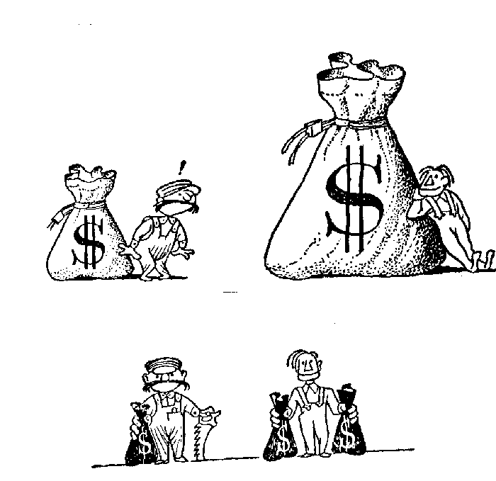
- Leverage Volume
- If you want to show increase in something e.g. salary, a fair way would be to use bar charts that only change in height
- But if you use geometrical shapes, e.g. bag of money to show the salary increase, the result will acquire a total area that’s 4 times bigger (2 x height, 2 x width).
- Don’t label the Axis
- The reader will make assumptions and if the chart looks impressive, he’ll make favorable assumptions.
Percentages don’t tell the whole story
When people talk increase in 10%, always wonder increase compared to what? Last month? Week? And was it an overall increase or did they pick a figure that increased the most?
- 2% return on sales
- 12% return on investment
- 5 million profit
- 35% increase in profits
Percentage means little when there’s no concrete number attached to it.
Correlation Not Causation
If B follows A, then A has caused B. E.g. Low grades follow smoking. So, students who smoke must perform worse in tests.
But what if the students who have low grades end up smoking? E.g. If people go to college, they end up making more money.
But we don’t know if these smart people will make more even if they did not go to college?
Proving without Proving
If you can’t prove you want to prove, demonstrate something else and pretend they’re same.
E.g. You can’t prove your nostrum cures colds, but you can publish a lab report that 1 gram of the substance killed 30,000 gems in a test tube in 11 seconds.
Averages can be biased
3 types of averages
Mean – adds all values and dived by total quantity
Mode – most common value in a data sample
Median – value in the middle of a sample
Biased statisticians can pick the one that most suit his needs. E.g. CEO could say his company salaries went up 40% in the last 10 years. But he wouldn’t say they went up 1% for doormen, 5% for low-level employees and 30% for the C-suite.
A Bible to Approach Statistics
- Who says so?
- Analyze the source. Is the source inherently biased?
- Is this an ad? Does the researcher want to defend his theory? Doe the newspaper wants to sell more with a sensationalist story?
- How does He Know?
- How did he conduct the research?
- Is the sample big enough?
- Did he send the questionnaire? Did he stop people in the streets? What could be wrong with that?
- What’s Missing?
- What other influences have not been considered?
- Was there large control group and does the author mention about it?
- If using percentages, does he also give the raw numbers to complete a picture?
- Did Somebody Change the Subject?
- Did he move one result to a similar but actually different environment?
- Does it Make Sense?
- E.g. Darrell says since life expectancy is only 63 years how would it make sense to make set the retirement age of 65?