
Typography design is the visual component of the written words. You can think of typography as the body language of writing. We all know it’s not about what you say. It’s about how you say it. The same holds true for writing. It’s not just about what you write. It’s also the way you write that counts.
Here are 8 simple ways you can use right now to immediately improve the way your writing appeals to your potential audience.
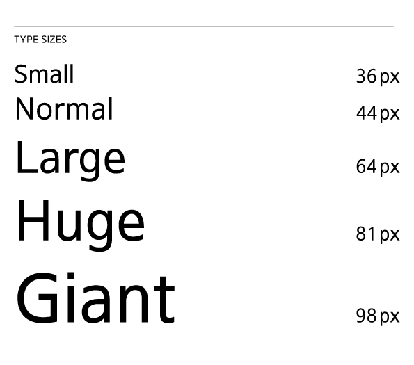
1. Size
Size matters when it comes to typography. Don’t be afraid to go big. More often than not, we go too small than we go big.
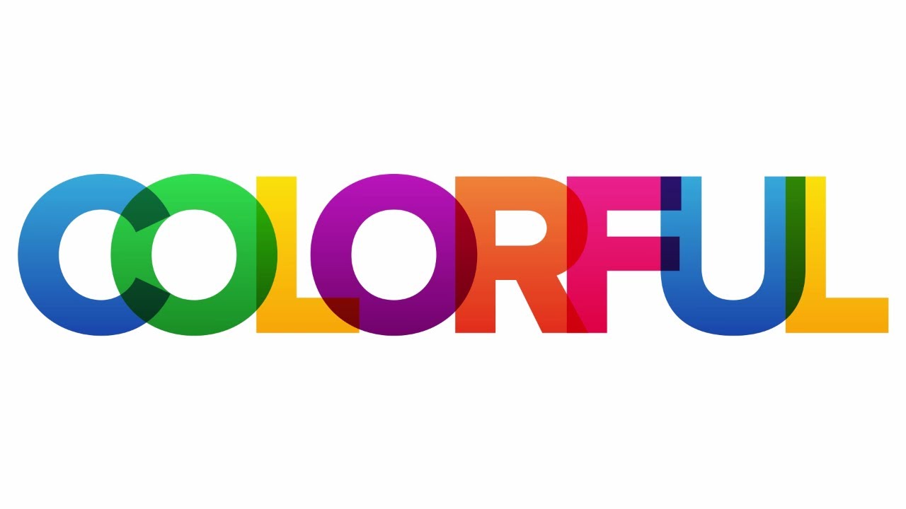
2. Color
Don’t get me wrong, a color palette can definitely help. It’s simply not the only thing we have. Experiment different approaches. Rely on your instincts. I’ve done it and got better results than simply letting a palette decide for me.
3. Weight
The basic rule of thumb is use thick fonts when you want to emphasize. A thin font on the other hand looks neat on the minimalist design, look no further than Apple and Google.

4. Caps
When it comes to capitalizing, we play it too safe by keeping low. Remember uless you’re messaging or copywriting, all caps doesn’t necessarily mean you’re shouting.
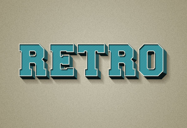
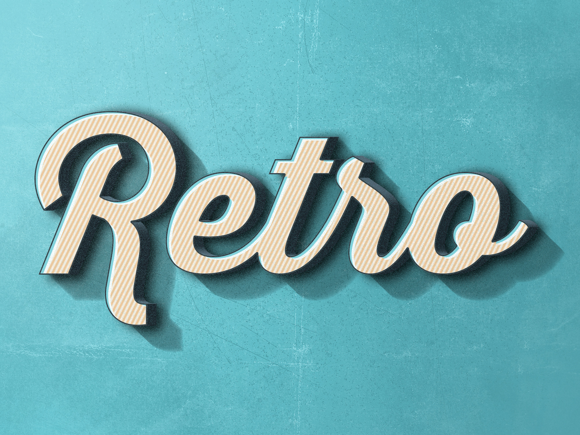
5. Shadows
Be careful shadows can be a bit distracting when you misuse them. That said, it can do more good than harm when applied correctly. So do experiment.
6. Outlines
Just like shadows outlines are double-edged sword. Use them with care.

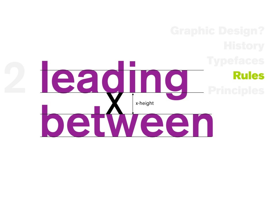
7. Line Spacing
The basic rule of thumb is to narrow the lines that belong together and widen that don’t.
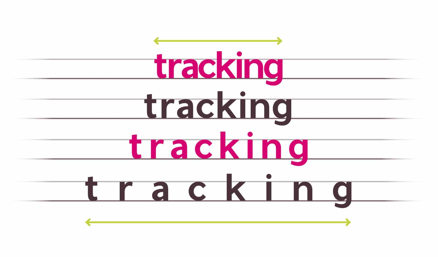
8. Letter Spacing
Go too close between letters and you’ll find it difficult to read, especially when the font is small. Space it too wide and you’ll find it look odd. So find the sweet spot between readability and aesthetics, and adjust accordingly.
There you go, as simple as that. Use these 8 simple techniques next time on your next typography design, and see the engagement rates skyrocket.
TLDR: Here’s a recap.
